Season Cards

Season Cards
There are plenty of playing card designs already, but they are usually too kitschy, too baroque, or too abstract. I want something functional and modern, but still something delightful that I could get attached to.

I watched people play a lot of different games, and when people hold cards in their hands, they arrange them to see only the small index images in the top corners. When I watched people play speed games, I asked them where they looked on the card to quickly see which card it was, and they indicated to the index images as well. After looking at actual card use, the center images seem unnecessary. Once I got rid of the center images, the cards had a much more open feeling of space and simplicity.

When designing the graphics, I started with Gotham. It is a modern, ubiquitous font that is easily recognizable with numbers and letters that are wide enough to look good on their own. It is everywhere and feels familiar to everyone. While it's probably overused, quick recognition is a plus for a lot of speed-based card games.

I crafted four suit symbols to complement the weight and style of the font. To make the symbols feel like a tighter family, I carried as much common geometry between them as possible.


Jokers are typically recognized by the center image. I wanted the jokers to match the rest of the deck, and since there will only be index symbols on the card fronts, I had to come up with an index symbol and letter that would on their own be easily recognized as joker. To make the J different from the jacks, I added a more elaborate serif to the J, and after a lot of feedback, I decided to pair it with a jester hat.


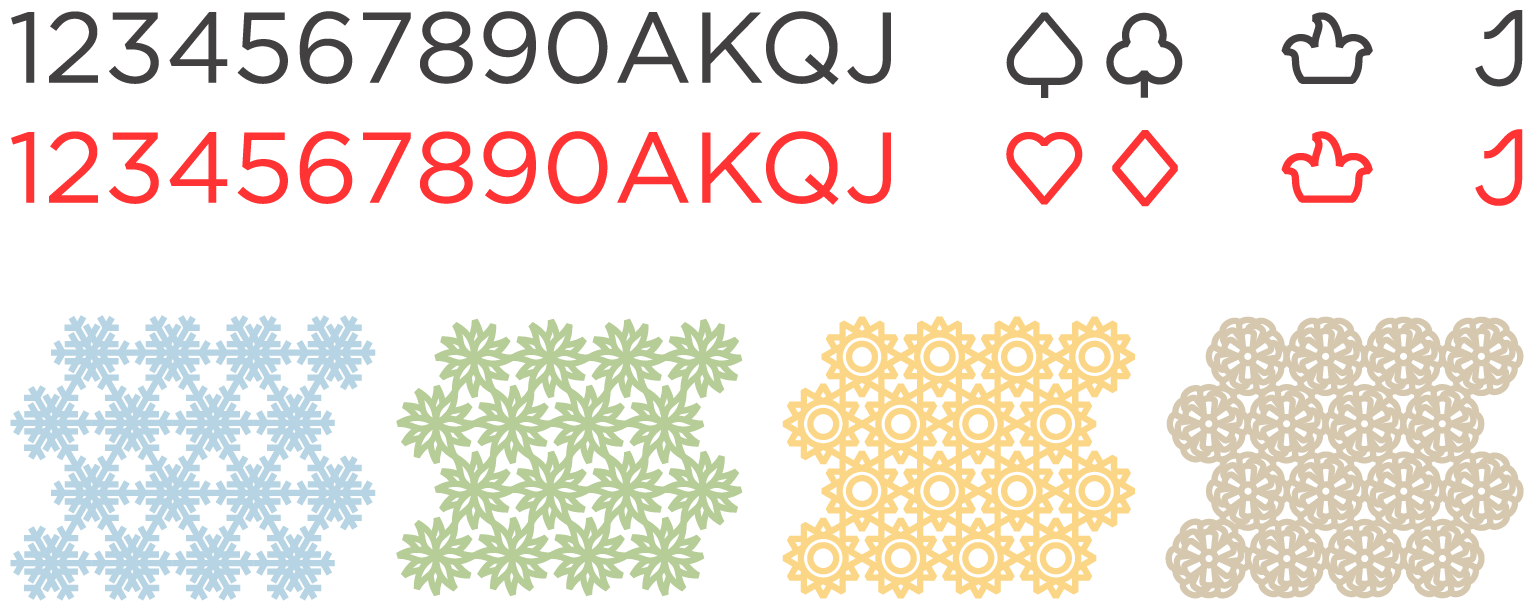
The design of the card fronts exist to distinguish them individually. Ideally, whatever is placed on the back of the card should have that same raison d’être. Therefore, if something is on the card backs, there should be multiple backs to differentiate between. Four decks seems like a good amount. Four suits, four players, four decks.
I settled on seasons. Winter, spring, summer, and fall make a natural cycle with no static hierarchy. With a minimal design like this, I wanted to prevent the sterile feeling that can sometimes happen when everything is stripped away, layers of meaning included. Seasons carry a lot of cultural meaning that can be drawn on to add some life and to keeping everything from getting too spartan.


I used the same line weights as the other symbols to keep consistency throughout the design. Each season symbol has the same repeatable hex pattern that is the same on all the decks.

The cards are printed on a 310 gsm (grams per square meter) paper with a center layer of dark fabric to make the cards opaque. There is also a slight fabric-like texture to the cards, which creates air pockets for the cards to glide smoothly on.


